
A Pattern Recognition Exercise
3 Historical Capex Trajectories That Tell Us When the Current AI Buildout Might Risk Reversing (and How to Protect Your Capital in a Midterm Election Window)

Markets leave fingerprints.
The names change, the technologies change, and every generation convinces itself that this time the script is different. But the same clues keep appearing before major turning points: capital rushes in, expectations climb, leadership narrows, and investors begin treating acceleration as permanence.
That is why pattern recognition matters.
It is not a crystal ball. It is a discipline. In life, it helps us recognize an old mistake wearing a new face. In markets, it helps us notice when a powerful truth is being priced as if nothing can interrupt it.
That is the spirit of this excerpt from May’s issue of Alpha Tier.
The question is not whether today’s boom is real. The question is whether parts of it have become too obvious, too crowded, and too dependent on uninterrupted acceleration.
To answer that, we study three patterns.
The first is the capital-spending cycle. Today’s AI buildout is already comparable with some of the greatest infrastructure booms in modern history. That does not make it bearish. Transformational technologies require transformational investment. But the railroad and internet cycles both offer the same warning: even when the technology changes the world, capital can still arrive too quickly, expectations can still run too far, and equities can still peak before the physical buildout does.
The second is market concentration. The current rally is being carried by a narrow group of winners whose earnings bridge to AI infrastructure is already visible. That explains the strength. It also creates fragility, because a market carried by fewer names becomes more sensitive to any disappointment in the story those names represent.
The third is the Presidential Cycle, especially the midterm-year window. Seasonality alone is not enough to build a thesis. But when a historically fragile part of the political cycle overlaps with narrow leadership, crowded positioning, speculative enthusiasm, and a politically charged environment, it becomes worth respecting.
None of this gives us certainty.
It gives us context.
And context is what investors need most when the story has become easy to believe.
In the full May issue of Alpha Tier, we translated this framework into portfolio action: what we trimmed, where we rotated, where we increased liquidity, and which signals would make us more defensive or more constructive from here.
This free excerpt gives you the pattern-recognition exercise.
Paid subscribers received the risk-budget decision.
Good reading.
In this month’s issue of VMF’s Strategic Asset Allocation, we published the chart below from J.P. Morgan’s research. It is one of the cleanest ways to understand the scale of what is now happening.
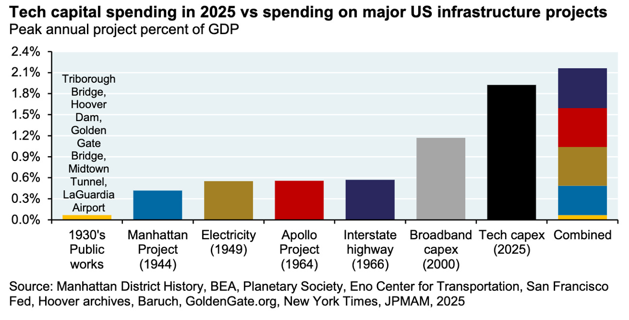
The conclusion is striking.
Measured as a share of GDP, today’s technology capex boom already exceeds the peak annual spending of some of the most famous infrastructure and innovation projects in modern American history: the Manhattan Project, the Apollo Project, the Interstate Highway buildout, the electrification wave captured in 1949, and even the broadband capex cycle of 2000.
That last comparison is especially important.
The broadband buildout was the physical layer behind the internet revolution. It was real. It was necessary. It helped create the digital world we now inhabit. But it also became one of the great capital-allocation mistakes of the late 1990s and early 2000s. Too much money chased the right idea too quickly, at the wrong price, with too little discipline...
The current AI buildout is already operating at a larger annual share of the economy than that cycle.
And when we broaden the lens, the comparison becomes even more interesting.
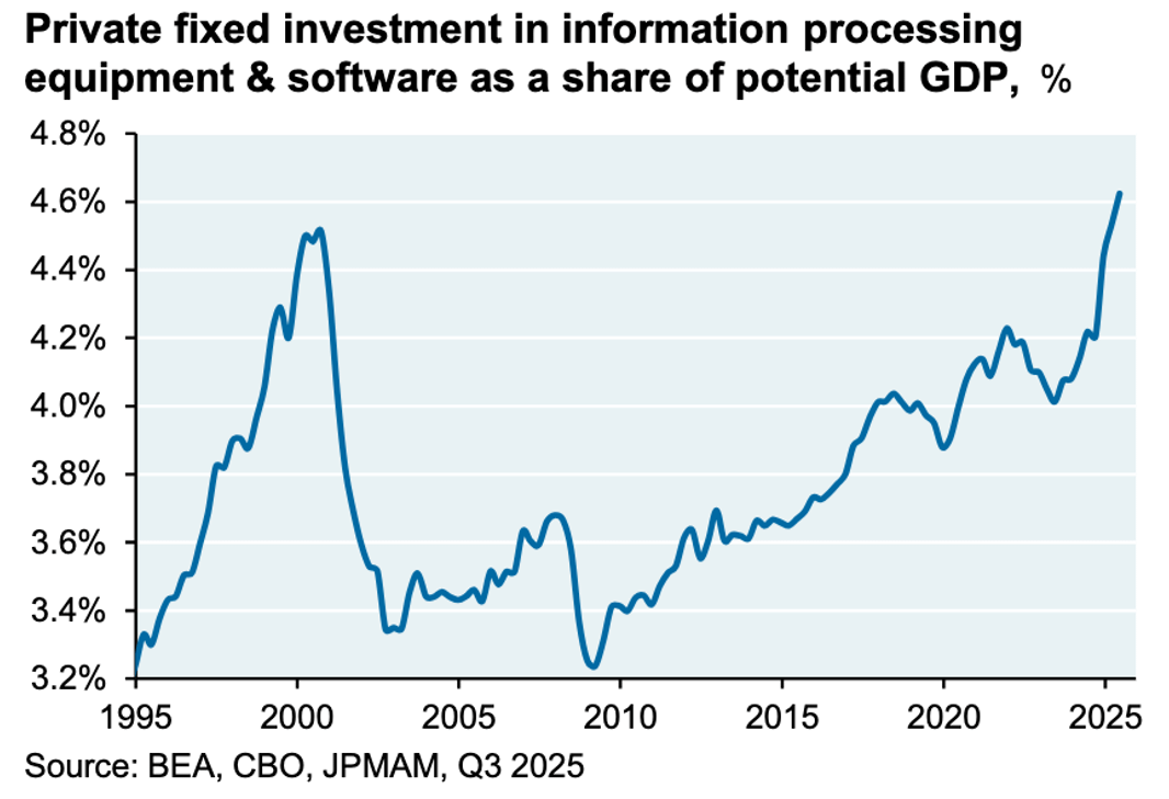
This second chart tracks private fixed investment in information processing equipment and software as a share of potential GDP. This broader measure captures more than just the narrow data-center buildout. It reflects the deeper capital cycle behind the digital economy: hardware, software, systems, and the infrastructure required to process information at scale.
On this measure, the current cycle has now surpassed the late-1990s and early- 2000s peak.
That moves the AI buildout from narrative to macro variable.
It means the AI-related capital cycle is no longer just something we can observe in stock prices. It is already visible in the structure of the economy.
But there is an important difference versus 2000.
The late-1990s boom was heavily populated by fragile companies, speculative business models, and young unprofitable technology firms trying to finance the future with cheap equity capital.
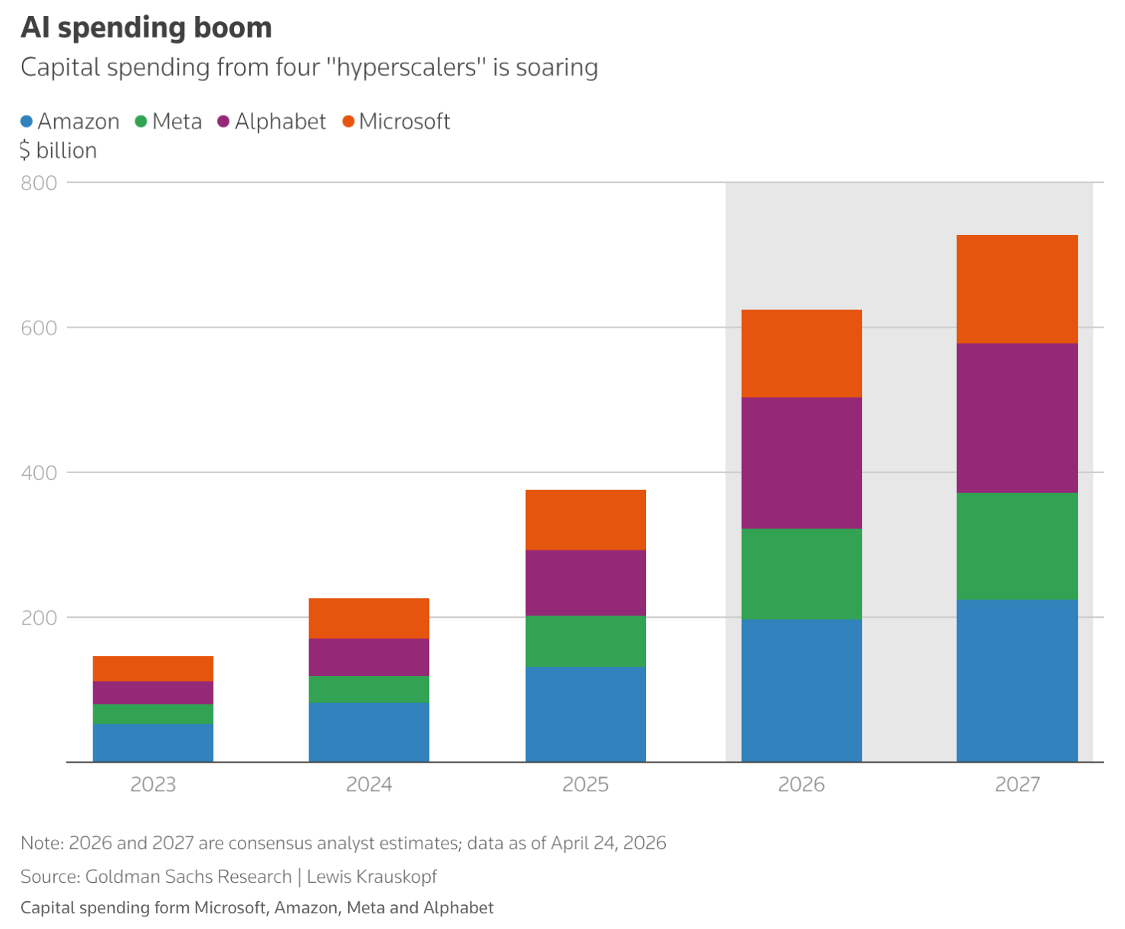
Today’s boom is being led by some of the most extraordinary companies ever created: Microsoft (MSFT), Amazon (AMZN), Alphabet (GOOG), Meta (META), and the broader ecosystem around them.
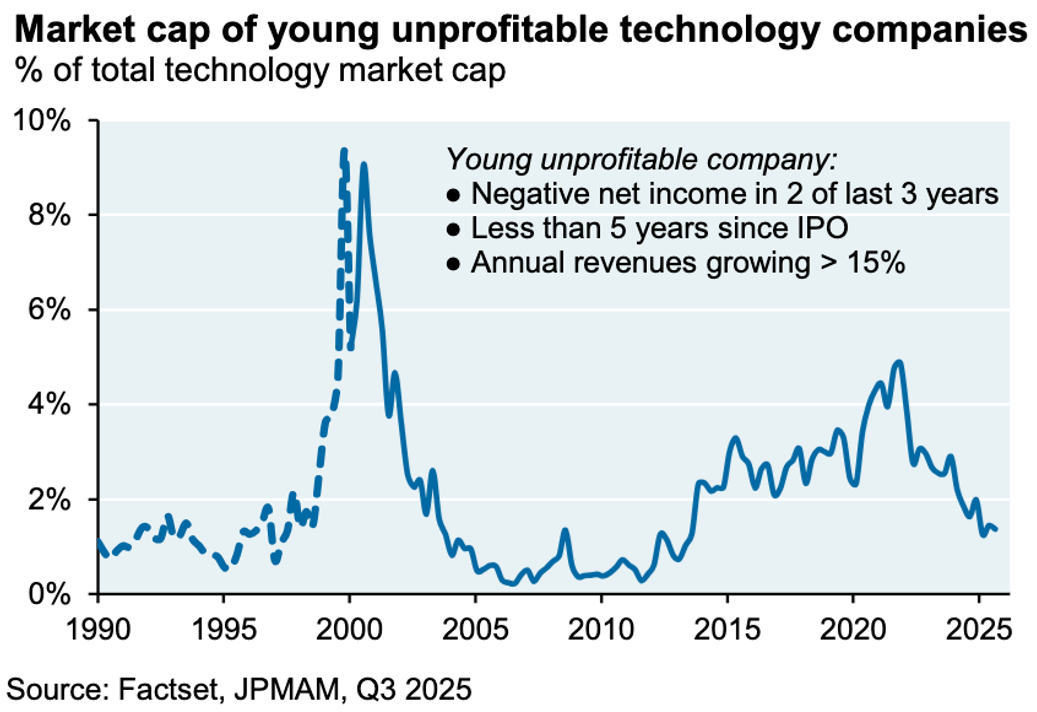
These are not garage-stage dreamers with no earnings. They are cash-generating machines with dominant market positions, enormous balance sheets, and strategic reasons to keep spending even when near-term returns are difficult to measure.
In our view, that makes this boom more durable.
It also makes it more dangerous to dismiss too early.
In fact, if we go further back in history, the railway manias remind us that truly transformative infrastructure booms can command an even larger share of the economy. In the British railway cycle, investment rose to more than 7% of GDP at its peak.
That is a much bigger number than today’s AI capex share.
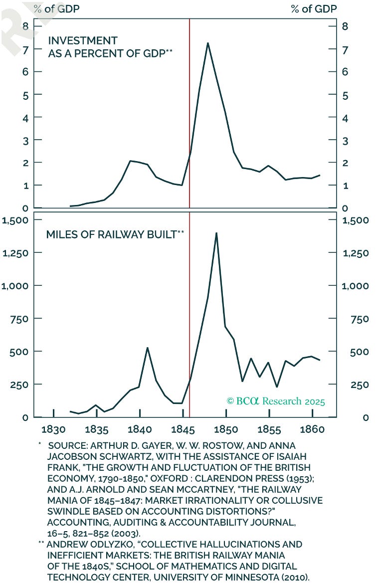
The railway comparison does not give us a simple bearish answer.
It points instead to a useful tension.
On one hand, it suggests the AI capex boom may still have further to run. If AI is even remotely as transformative as we believe (and potentially more consequential than railroads, electricity, or the internet) then it is not absurd to imagine this buildout absorbing an even larger share of economic output before the cycle matures.
On the other hand, the railway boom also gives us the key pattern we need to monitor. Stock prices led the physical buildout.
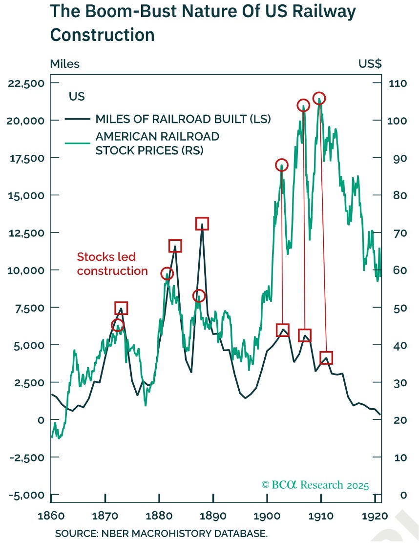
As the chart shows, railway stocks rose before construction peaked. They also rolled over before the actual construction cycle did. The market did not wait for the final mile of track to be laid. It repriced the future first.
That is the crucial lesson.
In capital-spending booms, equities do not trade on realized capex alone. They trade on the expected path of future capex, future revenues, future margins, and future returns on capital.
Which brings us back to AI.
Our hypothesis is not that the AI capex boom must end tomorrow. It is not even that actual AI spending needs to decline for the market to suffer. The more important variable is the rate of acceleration in expected capex.
As long as expectations keep rising, the obvious winners can keep rising with them.
If expectations stop improving, the burden of proof changes. And if expectations begin to fall, the market may no longer be willing to pay a higher multiple for the same story, the same earnings beat, or the same capex guidance.
That is why the next charts are so important.
Goldman’s late-2025 chart shows that consensus AI hyperscaler capex estimates for 2026 were still being revised meaningfully higher, reaching roughly $527 billion by November.
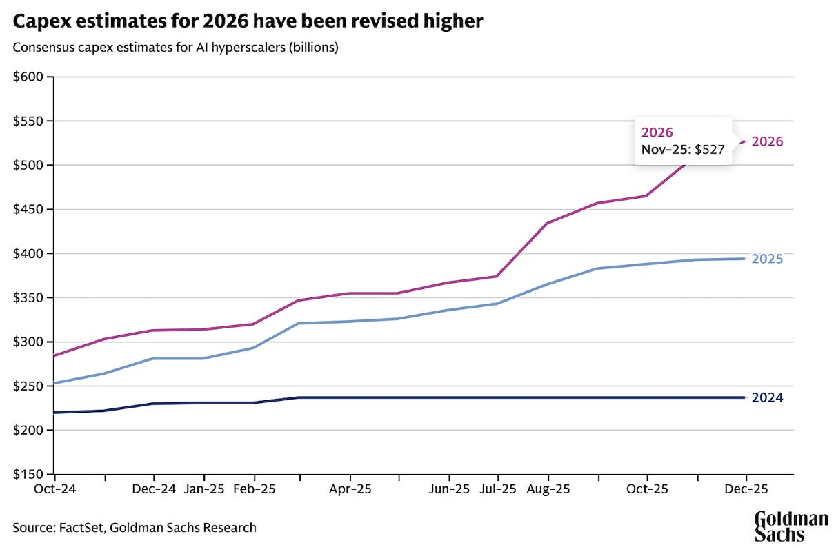
More recent estimates from late April 2026 point in the same direction. The company universes are not perfectly identical across estimates, but the message is consistent: expected AI-related capex is still moving higher.
The expected spending curve is still bending upward.
So... for now, the capex clock still belongs to the bulls.
The next pattern is more nuanced.
The AI rally is narrow... but not in a random way.
It is narrow because the earnings upgrades are narrow.
As the Goldman Sachs chart below shows, AI infrastructure stocks have driven the largest upward revisions to 2027 S&P 500 earnings estimates. Since the start of the year, consensus EPS estimates for AI infrastructure stocks have risen by roughly 32%.
Energy has also seen strong upward revisions, helped by the broader geopolitical and commodity backdrop.
The S&P 500 as a whole has seen estimates rise by around 8%. But the most important line is the grey one. Excluding AI infrastructure and Energy, S&P 500 earnings estimates have gone nowhere.
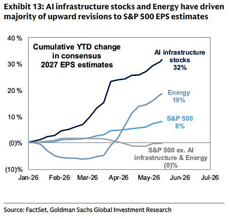
That tells us something important about the anatomy of this rally. The market is not yet paying for a broad, economy-wide AI productivity boom.
It is paying for the companies that are making money from the buildout today: chips, memory, hardware, capital goods, power, grid infrastructure, data-center suppliers. That is where the earnings revisions are visible. And markets always have a bias toward what they can see.
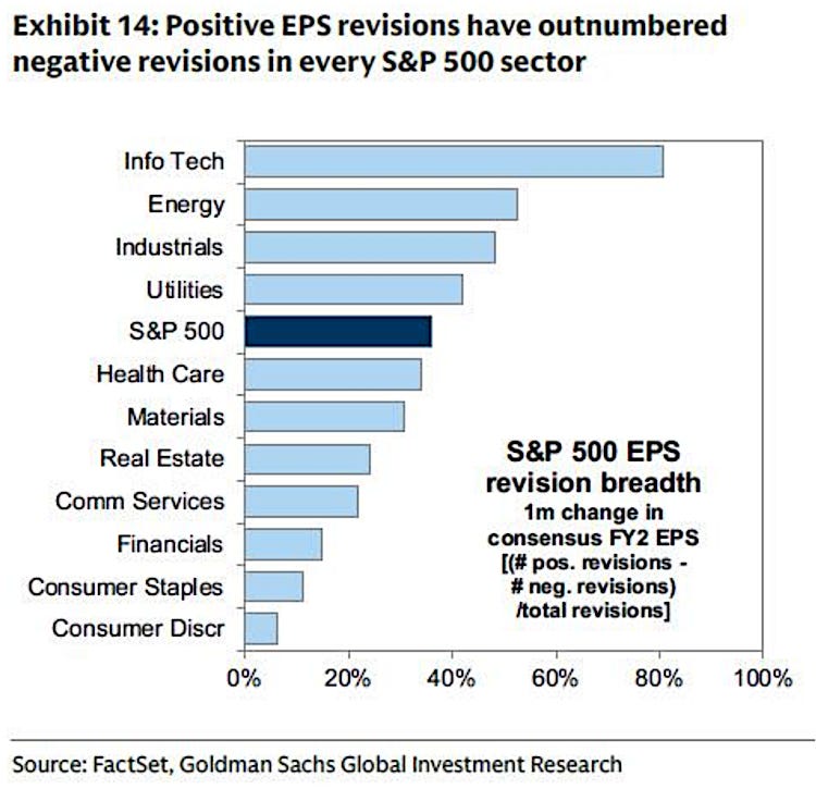
The below Goldman chart adds an important caveat. EPS revision breadth has been positive across every S&P 500 sector, so this is not a market where everything outside AI is deteriorating.
But the magnitude of the upgrade is still highly concentrated. The average sector may be seeing some improvement... the AI infrastructure complex is seeing the real acceleration.
This is where the concentration evidence becomes important.
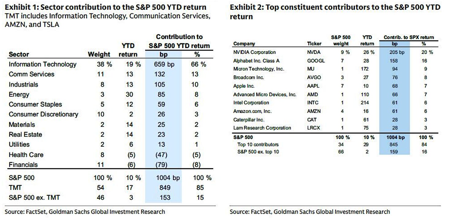
The same narrowness visible in earnings revisions is also visible in market performance. Goldman’s work shows that the S&P 500’s gains have been overwhelmingly driven by the AI-linked complex.
TMT, plus Amazon and Tesla, accounted for most of the index’s year-to-date return, while the S&P 500 excluding TMT was up only modestly. Nvidia alone contributed a disproportionate share of the advance. Since late February, the divergence became even clearer: semiconductors surged, the Mag 7 rose, the cap-weighted S&P 500 advanced, but the equal weighted S&P 500 declined.
So, the pattern is clear.
The earnings revisions are concentrated.
The index returns are concentrated.
And the leadership is concentrated around the companies most directly exposed to AI infrastructure spending.
That is not automatically bearish.
In fact, it partly explains why the rally has been so powerful. The market is rewarding the companies where the earnings bridge is already visible.
But it also tells us what kind of AI rally this is.
This is not yet a broad, full-spectrum AI mania where investors reward every company with a plausible AI story. During the internet bubble, thematic participation became much wider. The market rewarded telecom companies, software firms, portals, e-commerce platforms, incubators, concept stocks, and even companies whose main asset was the ability to attach themselves to the “new economy” narrative.
Today’s AI rally is different.
The market is mostly rewarding the companies with a visible earnings bridge to AI capex. It has not yet fully rewarded the broader application layer... the companies that may use AI to improve software development, customer acquisition, commerce, advertising, pricing, logistics, financial rails, research productivity, operating leverage, and decision-making.
That is why we must separate two questions.
First: who is benefiting from AI today?
Second: who may benefit from AI tomorrow?
Today, the answer to the first question is clear: the benefits are concentrated in the capex chain.The answer to the second question is still open.
And that is precisely why the broader AI cycle may still have further to run.
The market has not yet paid for every AI use case. It has not yet paid for every software winner. It has not yet paid for every marketplace, financial platform, commerce platform, or productivity beneficiary that may ultimately embed AI into its operating model.
But inside the first AI trade (the visible capex-beneficiary trade) the picture is different. There, the market has already found its winners...
Goldman’s momentum work reinforces the point. The current Momentum Factor rally is tightly linked to AI, especially memory and semiconductors.
Its long leg is tilted toward semiconductors, tech hardware, and capital goods tied to the AI infrastructure buildout, while its short leg includes software and commercial services companies caught in the market’s fear of AI disruption.
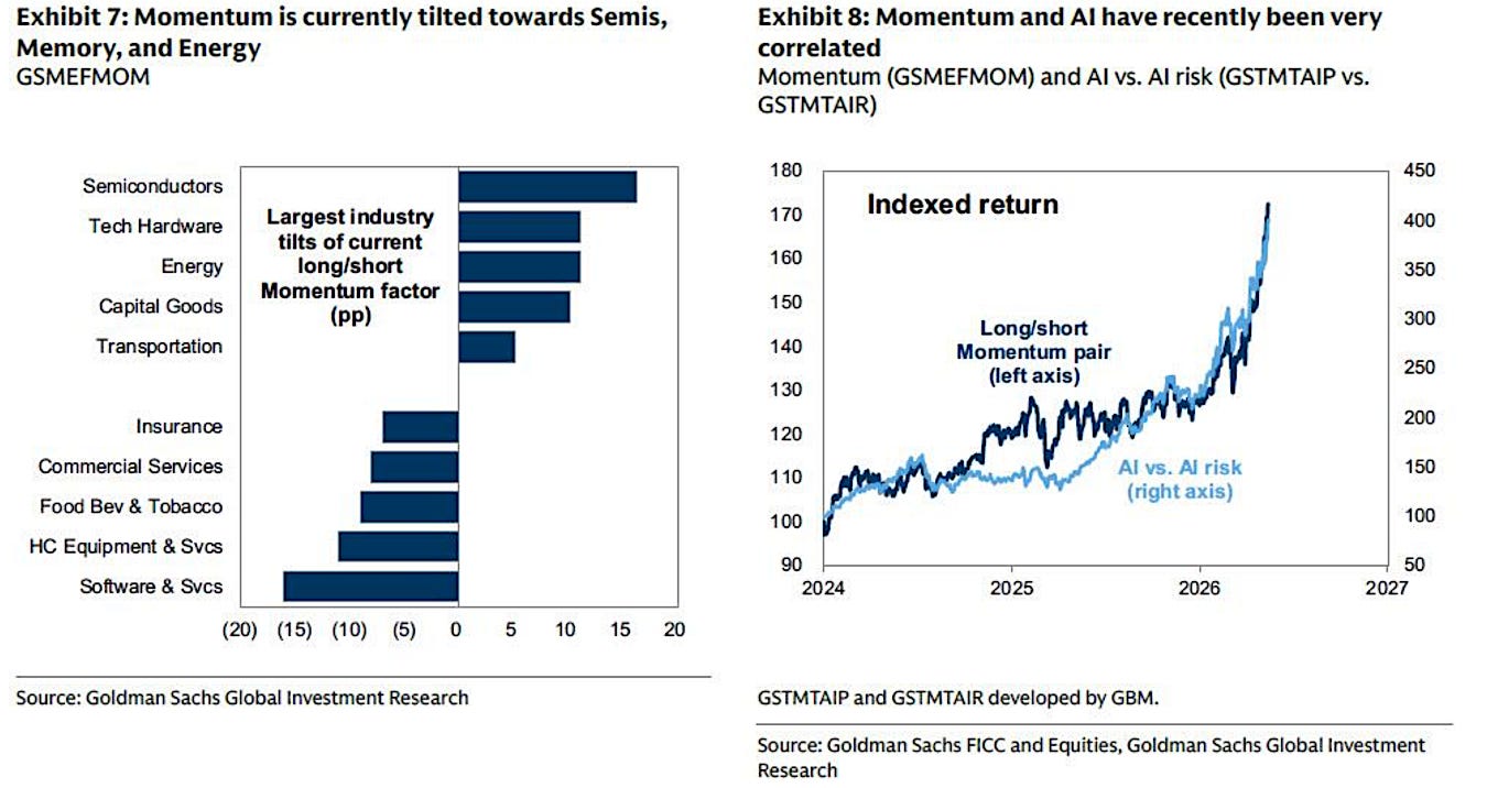
That is the whole market psychology in one chart.
The market is paying for AI capex today.
It is still discounting much of what AI may enable tomorrow.
That is why we closed our entire position in EWY in VMF’s Strategic Asset Allocation. EWI 0.00%↑ EWY, the South Korean equities ETF, is heavily influenced by Samsung and SK Hynix.
We bought it because the market was underpricing the memory bottleneck inside the AI infrastructure buildout. That bottleneck is no longer hidden.
In less than a year and a half, the position delivered more than 230% in total returns.
EWY did not fail our thesis. It fulfilled it.
You might also like reading:

The same logic explains why we have been adding exposure across the AI application layer throughout VMF Research: IGV, KWEB, Coinbase, Scottish Mortgage Investment Trust, Universal Music Group, Amrize and, more recently, PDD in VMF’s Security Selection.
You might also like reading:


This is not a retreat from AI.
It is a rotation inside AI.
The first trade was about the buildout.
The next trade may be about monetization.
Therefore, the conclusion is not that the AI boom is over. The conclusion is more precise: the first AI trade has become crowded, while the second AI trade is still being formed.
That is why our response is rotation, not retreat.
We are not selling the future.
We are selling the part of the future the market has already discovered.
This brings us to the final pattern-recognition test: timing.
The capex data says expectations are still rising.
The earnings data says the visible AI infrastructure winners are still receiving the strongest upgrades.
The concentration data says the rally is narrow, but not yet a full-spectrum AI mania.
That leaves price and time.
We begin with the long-term chart we first published in the September 2025 issue of Alpha Tier.
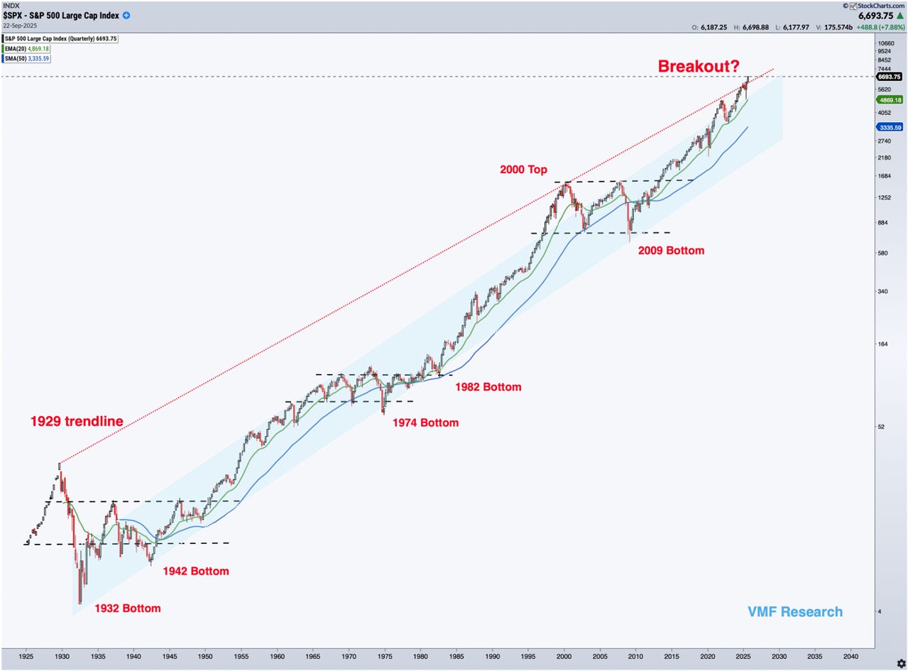
This chart has been central to our roadmap because it captures one of the most important features of market history: secular bear markets are rarely single events.
They are long structural ranges.
The crash is only the beginning.
The repair takes years.
The new secular bull does not truly declare itself at the low. It declares itself when the market finally breaks out of the range that contained the prior bear market.
That distinction is crucial.
Beat the old playbook.
Get institutional-grade research delivered to your inbox.
The 1942 low was generational, but the 1950 breakout confirmed the new secular bull. The 1974 low was generational, but the early-1980s breakout confirmed the next regime. The 2009 low was generational, but the 2013 breakout above the long 2000–2013 range confirmed the current secular bull.
This is why Bank of America’s long-term roadmap is so interesting.
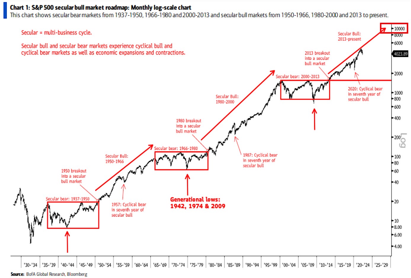
BofA reaches a very similar conclusion. Its chart also treats 2013, not 2009, as the beginning of the current secular bull market. That is unconventional, but technically sound. Secular bulls do not begin when prices stop falling.
They begin when prices escape the old structure.
In our view, that is the right way to think about this market.
It also fits the broader Fourth Turning framework we have been developing since Alpha Tier’s early issues. Generational lows tend to emerge during periods of institutional stress, political disorder, policy experimentation, and social fracture.
But markets do not immediately leave those regimes behind. They first repair. Then they break out. Only later does the new secular bull become obvious.
That is exactly what happened after 2009.
From this perspective, the current bull market may still have further to run. If we date the cycle from the 2013 breakout, the AI capex boom could still represent the final, powerful phase of a secular advance rather than its immediate end. That would also fit our Fourth Turning roadmap: a period of crisis, fiscal dominance, technological acceleration, geopolitical tension, and speculative capital pushing toward a dramatic climax before the next regime begins.
The long-term chart, then, does not force a bearish conclusion.
It leaves room for a melt-up.
But it also tells us the bull market is no longer young.
BofA’s chart adds one more pattern worth noting: prior secular bulls suffered major cyclical bear markets around their seventh year. The 1957 decline appeared in the seventh year after the 1950 breakout. The 1987 crash came in the seventh year after the 1980 breakout. And if we use 2013 as the starting point for the current secular bull, the Covid crash arrived in the seventh year as well.
We should not turn this into a law. The sample is tiny. Three observations do not make a trading system.
But as pattern recognition, it matters.
The point is not that every seventh year must produce a crash. The point is that secular bulls can absorb violent cyclical declines without ending. That is why the 2020 crash did not invalidate the secular bull. It may have confirmed its structure.
So, the long-term message is balanced: the secular bull may still have further to run, but the cost of complacency is rising.
The shorter-term pattern is less forgiving.
We are now in a midterm election year. And as the table below shows, the April to-October window in midterm years has historically been one of the more difficult stretches for U.S. equities.
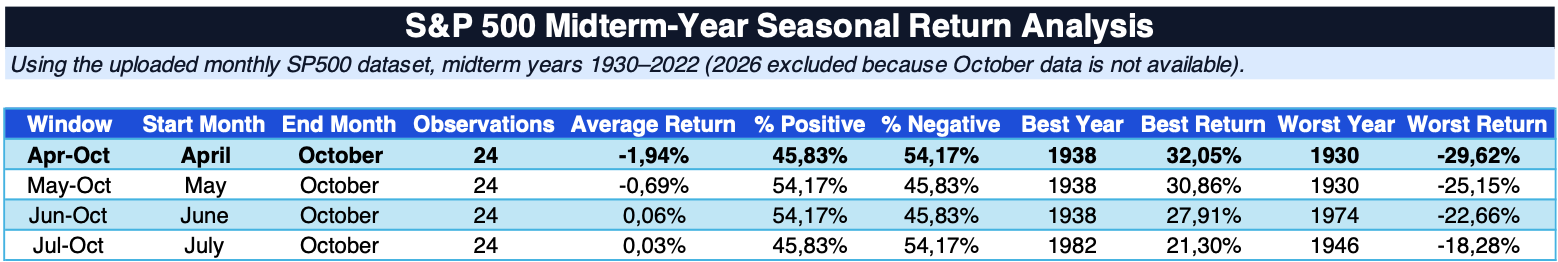
Using the long-term monthly S&P dataset, midterm years from 1930 to 2022 show an average April-to-October return of -1.94%, with only 45.83% of observations positive.
The shorter windows are less dramatic: May-to-October is only modestly negative on average, while June-to-October and July-to-October are close to flat.
This is not a mechanical sell signal.
But the left tail matters
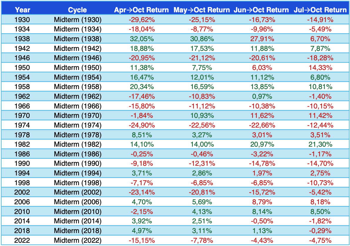
The worst outcomes are not random...
Many of the deepest losses occurred inside, or near, the same secular repair regimes we identified in the long-term chart: 1930 and 1934 during the post-1929 structural bear market; 1946 during the long post-war transition; 1966 and 1974 around the inflationary secular bear; and 2002 during the post-dot-com secular bear. More recently, 2022 also fits the profile of a politically charged, inflationary, liquidity-sensitive regime.
That is where this seasonal work becomes more useful.
Midterm weakness is not equally important in every environment. It matters more when it overlaps with regime stress: inflation pressure, political volatility, populist policy impulses, narrowing leadership, and investor crowding.
That is why the 1970s remain an important analogue. They were not just weak midterm years. They were weak midterm years inside a populist, inflationary, institutionally strained period. As we have argued in prior issues, today’s environment increasingly shares some of those features: fiscal dominance, industrial policy, tariffs, geopolitical fragmentation, redistribution pressure, and a political system increasingly willing to use economic policy as an electoral weapon.
That does not mean 2026 must behave like 1974.
But it does mean the current window deserves respect.
Put the pieces together...
The long-term chart still allows for a final secular-bull advance. The AI capex cycle is still accelerating. The application layer has not yet fully participated. And if the AI boom broadens, the upside could remain powerful.
But the short-term setup is less benign. We are entering the weakest seasonal stretch of a midterm year while the market is increasingly dependent on AI capex expectations, narrow leadership, crowded Momentum, and parabolic winners.
That is why this issue began with a pause.
Not because the future has stopped being exciting.
Because it has become too easy to believe.
And when a mature secular bull, a transformative technology, a narrow market, and a fragile seasonal window begin to overlap, the right response is not panic.
It is judgment.

A quick note on accountability.
We don’t publish these theses to be right on paper. We publish them to express edge in the real economy. Our Leaderboard shows the exact scorecard since inception, tracking every position, our compounding outperformance against the market, and the triple-digit winners we’ve captured along the way.
Great read and Superb analysis, as always!